Courses: Introduction to GoldSim:
Unit 6 - Carrying Out a Dynamic Simulation
Lesson 12 - Formatting Results and Using Result Elements
To close out this Unit, we are going to spend a bit of time exploring how to display and format result charts in GoldSim.
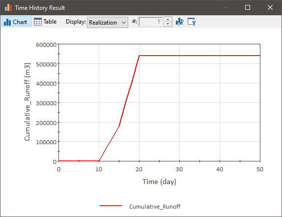
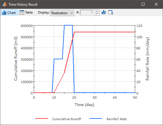
To do so, let’s view the result from the model you built for the Exercise in the last Lesson. It should look like this (make sure the model is in Result Mode, right-click on the Reservoir, and select Time History Result…):
Note the toolbar at the top of the dialog. We can use this to control the display. We have seen previously that the Table button changes the display from a chart to a table. Let’s focus for now on the two buttons on the right side of the toolbar:

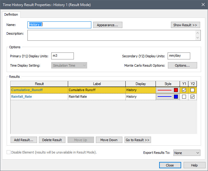
The button furthest to the right is the Edit Properties button. The other button is the Chart Style button (this is indicated in a tool-tip if you hold your cursor over the buttons). We’ll discuss the Chart Style button in the next Unit. For now, let’s press the Edit Properties button. This dialog will be displayed:
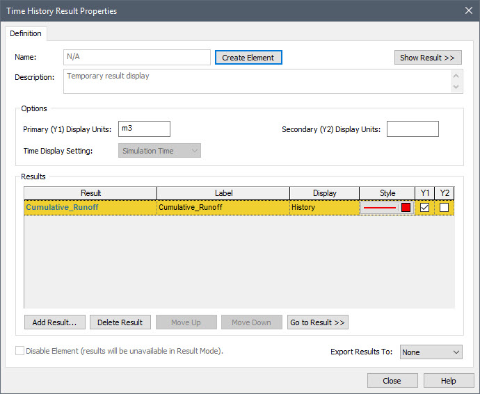
The Add Result button allows you to add multiple outputs to the chart. If you press the Add Result button, a dialog will be displayed for selecting another output. Select the rainfall rate. The dialog will now look like this:
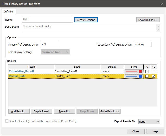
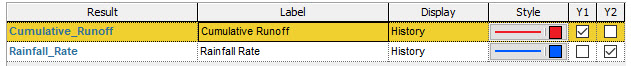
Note that the rainfall rate has been added as a second item. Note also that Y2 has been checked on for that output. This simply indicates that it will be plotted on the second y-axis (the axis on the right), since its dimensions are different from the first output, which will be plotted on the left (Y1) y-axis.
Note: You can add as many outputs to this list as you want. However, GoldSim can only plot two sets of dimensions (and GoldSim automatically assigns the axes). If you add an output with a third set of dimensions, both Y1 and Y2 checkboxes will be cleared for that output. That is, it will not be plotted (although it can be displayed as a Table). If you wish to plot it, you can click Y1 or Y2, and GoldSim will then clear the outputs that were previously assigned to that axis.
Note: Within this dialog you can choose to change the units of either y-axis units (Primary Display Units, Secondary Display Units). Of course, the dimensions of the units must be consistent with the result being plotted (e.g., you cannot change m3 to m). Changing these units here does not change the Display Units for the elements themselves. It only changes the display units used in the Chart or Table that is displayed.
We could now display the chart again by pressing Show Result >>. But before we do so, however, let’s make a few other changes in this dialog.
First note that you can change the line Style for each output. By default, the two line styles that were added were red and blue. Press the second (blue) button under Style in the list. It will display this dialog that allows you to change the line style:
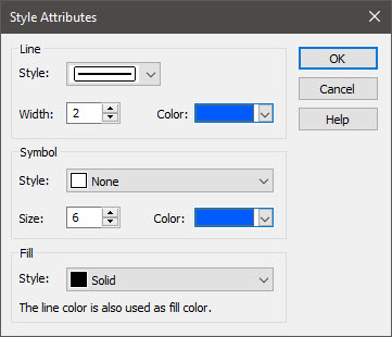
We won't bother to do so at this point, so you can close the Style dialog.
Next, let’s look at the Label column. This column determines how the output is labeled in the chart legend and axes. By default, it is the name of the output. However, since output names cannot have spaces (but Labels can), let’s modify them now so they have spaces so it looks like this:
Now press Show Result >> to display the chart:
Now close the chart window (by pressing the X) and/or close the Time History Properties dialog (by pressing the Close button). Next, view the chart again (right-click on the Reservoir, and select Time History Result…). You will note that the changes that you made (adding the second result, changing the color, changing the labels) are all gone!
What happened? When you right-click on an element to view results, the result display itself is temporary. That is, the display is recreated every time your right-click and choose to view it. It is not saved by GoldSim (and hence none of the changes that you made are saved). Of course, if you are going to bother to make such changes to a display, you want them to stick around. So how do we tell GoldSim to do that? To do so, we need to create a Result element.
Press the Edit Properties button, and make all the changes that we made before (add a second output, change the color for the second output, and change the labels). Now press the Create Element button at the top of the dialog. When you do so, the dialog will change slightly to look like this:
Note that you can now assign a Name to this element. And unlike other element names, this name can have spaces. Let’s change it to “History Plot”. Then close the dialog, and you will now see a new element in the graphics pane:

This is a Time History Result element.
If you double-click on it (while in Result Mode), the chart is displayed (preserving all of the formatting changes you have made). If you return to Edit Mode, re-run the model, and double-click on it again, the formatting is still there.
There is one more interesting feature of Result elements: they are modeless. If you simply right-click on an element to view a result, while you are viewing that result, you cannot do anything else (until you close the display window). This is because the standard result display is modal (it locks the focus of the application). However, while a Result element is open, you can actually explore the model (and even open up other Result elements, so that multiple results are displayed at the same time).
These features can help you to envision how you would use Result elements:
- To quickly display key results that you want to look at whenever you run the model and have been nicely formatted.
- To view multiple results charts or tables simultaneously.
We will learn about other uses in subsequent Units, such as:
- To easily access key results from deep within a hierarchical model.
- To export results to a spreadsheet.
- To view result displays in Dashboards.
Note: You may have noticed that influences are not drawn to Result elements from the elements that are being referenced. This helps to keep the graphics pane less cluttered with influences.
Although we only changed the line style in this Lesson, GoldSim provides many other options for formatting charts (and these are accessed via the Chart Style button that we mentioned above). We’ll discuss some of those options in the next Unit.
Since we have changed this file (by adding a Time History Result element), remember to save it to the “MyModels” subfolder of the “Basic GoldSim Course” folder on your desktop (call it Exercise3.gsm). We will explore the results of this model in the next Lesson.