Courses: Introduction to GoldSim:
Unit 7 - Modeling Material Flows
Lesson 8 - Allocating Flows Using the Allocator Element
When simulating the flow of materials (such as water or money or people) through a system, it is quite common to split a flow at a particular point and redirect it to multiple destinations. In the previous two Lessons, we discussed an element that facilitates this: the Splitter. Splitter elements split an incoming signal (typically a flow of material) between a number of outputs based on specified fractions or amounts.
In some situations, however, it is not possible to simply specify how a signal (a flow) is split. Instead, there may be multiple competing “demands” on that flow and the total demand may exceed what is available. In such a case, the flow must be allocated between those demands, based on priority.
For example, suppose that a certain flow rate of water was available in a pipeline (e.g., 100 m3/hr), and the pipeline split into three branches (e.g., to three different cities). Suppose further that the three cities each had a demand of 40 m3/hr. Clearly, there would not be enough supply to meet the demand of each city, so the flow would need to be allocated (according to some priority) between the three cities. Alternatively, suppose that a “flow rate” of money (a cash flow) was available for a company (e.g., 1000 $/week), and three different business units needed that cash flow. Suppose further that the three units each had a demand of 400 $/week. Clearly, there would not be enough supply to meet the demand of each of the units, so the cash flow would need to be allocated (according to some priority) between the three business units.
Such a situation is quite common when simulating material flows (such as water, money or even people). Therefore, GoldSim provides a specialized element to facilitate this called an Allocator. Allocator elements allocate an incoming signal to a number of outputs according to a specified set of demands and priorities.
In order to understand the Allocator, let’s start with a new model, and insert an Allocator element (you will find it in the “Functions” category):
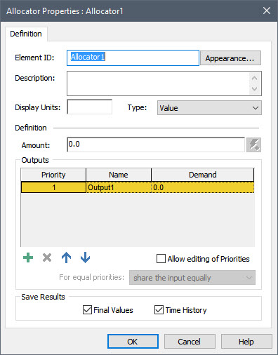
The incoming signal to the Allocator is the Amount. The outputs of the Allocator element are specified in the "Outputs" section of the dialog. By default, an Allocator element initially has a single specified output (named Output1). You can add additional outputs by pressing the Add button (the plus sign) below the list. Outputs can be deleted using the Delete button (the X), and moved up and down in the list using the two buttons to the right of the Delete button. The names of the outputs can be changed by editing the items in the Name column. For each output, you must enter the Demand (and these must have the same dimensions as the input Amount). Each output is assigned a Priority when it is created, and by default, the only way to change the Priority is to move the output up or down in the list.
To get a feeling for how an Allocator works, let’s add a few inputs here and run the model. The Display Units for an Allocator must reflect the dimensions of the incoming signal (the Amount). Let’s assume that this is a flow rate of water, and assign Display Units of m3/day. Then let’s simply enter a constant for the Amount equal to 100 m3/day.
Next, let’s add two additional outputs by pressing the Add button, and rename the three outputs as Flow1, Flow2 and Flow3. Finally, let’s define Demands for Flow1 and Flow2 equal to 50 m3/day, 40 m3/day and 20 m3/day, respectively. When you are done, the element should look like this:

Note: As noted previously, you should never enter values like this directly into a dialog. Instead, you should create Data elements for these inputs (100 m3/day, 50 m3/day, 40 m3/day and 20 m3/day) and link the Data element to the input fields. We are entering the inputs directly here simply to quickly illustrate how an Allocator works.
By default, each output has a fixed (and unique) Priority (which is an integer). The Priority of the outputs always decrease downward (with the first item having a Priority of 1). Priority 1 therefore represents the “highest” priority demand, 2 the next “highest”, and so on.
Close the dialog (press OK), and run the model. Now left-click on the output port for the element:
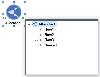
You will note that the Allocator has four outputs (one for each of the Demands that you created in the dialog, and a fourth output named “Unused”). The first three report what is allocated to each of the Demands; the “Unused” output reports whatever is left over (and would only be non-zero if the supply exceeded the total demand). All of these outputs are secondary outputs. Like a Splitter, an Allocator does not have a primary output, as none of the outputs of an Allocator are necessarily more important than the others.
Let’s now plot all four outputs on one chart. Because the Allocator only has secondary inputs, you will need to plot the first output by left-clicking on the output port, and then right-clicking on one of the outputs. Once you add one output, you can add the other three outputs by opening the Time History Result Properties dialog from the chart (recall that this is done by pressing the toolbar button that is furthest to the right), and pressing Add Result from the Time History Result Properties dialog. After adding all of the outputs, the chart will look like this:
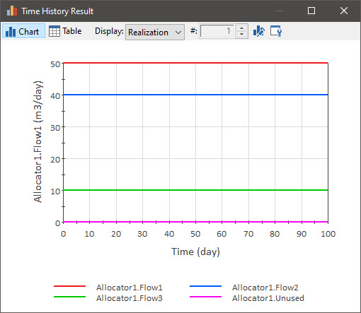
As you can see, Flow1 and Flow2 receive their full demand (50 m3/day and 40 m3/day, respectively). Flow3, however, only receives half of its Demand, since it had the “lowest” Priority, and there was not enough supply to meet all three demands. This is because as we mentioned above, outputs with lower valued Priorities are met first (e.g., a Priority of 1 is met before a Priority of 2). That is, the lower the value, the “higher” the Priority. The “Unused” output is equal to zero, as all of the supply was used (in fact, there was a shortage).
If you check the Allow editing of Priorities checkbox, you will see that the Priority column becomes editable. In this case, the Priorities can be specified as constants or expressions and/or links, and may change with time. They do not need to be integers and can be any real value (positive or negative). Outputs with lower valued Priorities are met first (e.g., Priority -2.4 is met before Priority 5.7). Moreover, multiple outputs can be assigned equal priorities. If multiple outputs have the same Priority, you can specify the manner in which equal priorities are treated in the For equal priorities field. There are two options: 1) “share the input equally”; or 2) “share proportional to demands”. You can read about how GoldSim handles such situations, along with other advanced options for Allocators, in GoldSim Help.
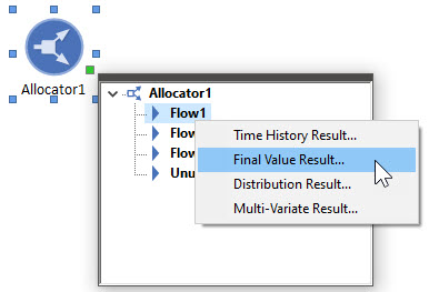
This simple example provides a good opportunity to take a short detour and introduce a new type of GoldSim result that can be displayed. Let's do that now. Left-click in the output port of the Allocator and then left-click on the first output (Flow1). Select Final Value Result... from the menu:
When you do so, the following chart will appear:
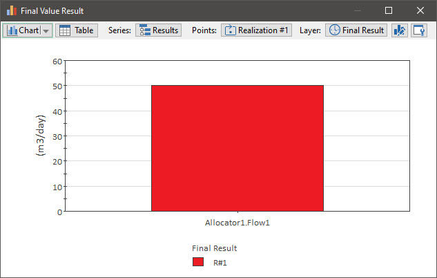
Final Value result displays allow you to compare results in the form of bar charts, column charts, pie charts and tables. So the display is not really meaningful until we add some things to compare. In this case, we can compare the three flows. To do so, open the Final Value Result Properties dialog from the chart (by pressing the toolbar button that is furthest to the right):
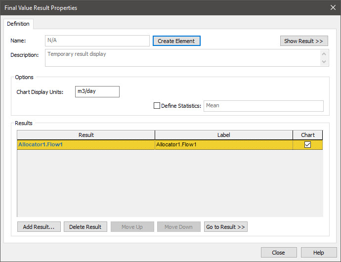
Next press Add Result... (twice) to add the other two flows:

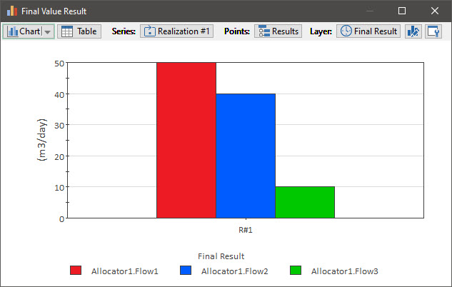
Now press Show Result:
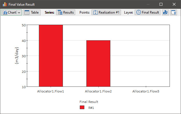
Finally, let's change the Y axis to start at 0. To do so, select the Chart Style button (second from the right), select the Y-Axis tab, and set the Minimum to 0):
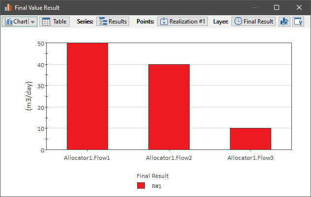
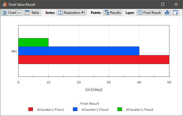
This is a column chart showing the Final Value of each output. Final Value results can be displayed in a number of ways changing how the Series and Points (and in some cases, the Layer) fields are specified (and this makes them very powerful and flexible). For this particular result, the most effective way to display these results is to "flip" the Series and Points. Go to Series, and select "Realization #1". The chart now looks like this:
This is what is known as a clustered column chart. But we can also display it as a clustered bar chart (by selecting that option from the Chart drop-list):
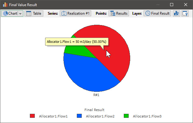
There are several additional options also, such as a pie chart:
Final Value results are powerful (and a bit complex), but their features are well worth exploring. We will see examples of their use again later in the Course.