Courses: Introduction to GoldSim:
Unit 10 - Building Hierarchical Models
Lesson 9 - Protecting a Container
In some cases, you may want to protect the contents of a Container from being modified. For example, if multiple people are editing a model, you may want to ensure that parts of the model are not inadvertently modified. Or once a part of a model has been tested and ensured for quality, you might want to prevent any future changes from being made.
GoldSim provides two options (sealing and locking) for doing so. Sealing a Container causes a warning message to be displayed whenever you attempt to modify the contents of the Container. Locking a Container completely prevents anyone from editing or modifying the contents of the Container. A password is required to unlock a Container.
To explore these two options, let’s open a model we built in a previous Exercise. You should have saved a model from the last Exercise and named it Exercise13.gsm. Open the model now. (If you failed to save that model, you can find the Exercise, named Exercise13_Localized_Containers.gsm, in the “Exercises” subfolder of the “Basic GoldSim Course” folder you should have downloaded and unzipped to your Desktop.)
Double-click on the Pond1 Container and select the Protection feature in the Container dialog. When you do so, the following dialog for specifying how you would like to protect the Container is displayed:
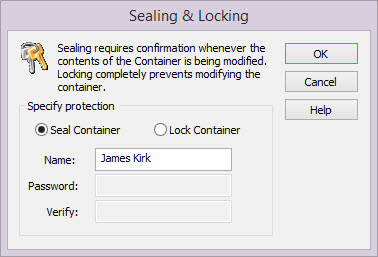
Your Windows user name will be inserted by default into the Name field (which you can subsequently edit).
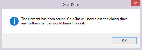
By default, the option to Seal Container will be selected. The Container can then be sealed by pressing the OK button. Upon doing so, the following dialog will be displayed:
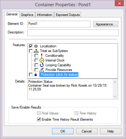
Now let’s go inside the Container. Open Inflow and change it from 10 m3/day to 15 m3/day. When you do so GoldSim will provide a message warning you (twice!) that the seal will be “broken” if you continue. Basically, once a Container has been sealed, you can make “cosmetic” changes to the contents (moving elements around in the graphics pane, adding text, graphics or images to the Container), but if you try to make any other kind of change (e.g., changing the inputs to an element, adding an element) GoldSim will provide the warning message. It does not prevent you from making the change; it simply warns you before you do so.
Once you make such a change (and the seal is broken), this new status (along with who broke the seal and when it was broken) is displayed in the Details section of the dialog for the Container:
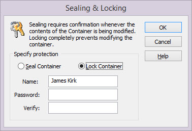
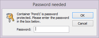
A stronger form of protection is to lock a Container. Double-click on the Pond1 Container again and select the Protection feature in the Container dialog. This time, select the Lock Container option. When you do so, you will be prompted for a password:
The Container can then be locked by pressing the OK button. Upon doing so, the following dialog will be displayed:
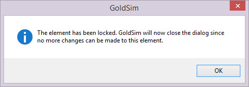
Now let’s go inside the Container. Open Inflow and try to change its value. You will find that you cannot. This is because the property dialogs of all elements within a locked Container are grayed out. In addition, when viewing the contents of a locked Container, most menus are disabled. This is because you cannot make any changes at all to the contents of a locked Container (or to the properties of the locked Container itself). You can view the contents of a locked Container (and all the properties of the elements within the Container), but the contents of the Container cannot be edited until the Container is unlocked. Moreover, whenever you are inside a locked Container, the cursor is changed to an image of a lock to remind you that the Container is locked.
Let’s now unlock the Container. To do so, click on the Protection checkbox on the properties dialog for the Container. You will be prompted for a password:
Enter the password and press OK. The Container and its contents will then be available for editing.
Note: If you choose to lock a Container, take great care to record the password somewhere! Note, however, that if you forget the password, you can contact the GoldSim Technology Group (via the GoldSim Help Center) and we can provide a “skeleton key” to unlock the Container.