Courses: Introduction to GoldSim:
Unit 14 - Modeling Discrete Events
Lesson 9 - Delaying Events and Simulating Processes and Queues
We discussed Material Delay elements in Unit 9, Lesson 3. Material Delay elements are used to simulate delays in the physical movement (flow) or in some cases the change of state (e.g., eggs to chickens) of material within a system. When we discussed Material Delays, however, we mentioned that they are not the only kinds of delays that can occur in a system.
For example, in some cases, we will want to delay discrete signals in order to realistically represent a system. In particular, we can use Event Delays to model a “process”. We use the term “process” here to mean something that operates on a discrete item or instance, and takes a specified amount of time to complete. Examples of such processes include moving a widget through a machine (that operates on or processes it in some way), transporting an item from one location to another, or, as we will see below, carrying out maintenance on a facility or machine.
This is best illustrated by considering a very simple Example. The model can be found in the “Examples” subfolder of the “Basic GoldSim Course” folder you should have downloaded and unzipped to your Desktop. In that folder, open a model file named Example26_Event_Delay.gsm.
The model looks like this:
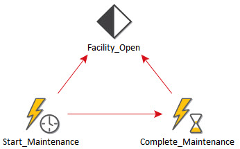
This model is simulating a preventive maintenance process. The Timed Event (Start_Maintenance) occurs regularly, every 30 days. That is, preventive maintenance begins exactly every 30 days. Of course, preventive maintenance takes a certain amount of time. During that time, perhaps other things in the model must behave differently. In order to model that, we would need to be able to reference whether or not maintenance was underway. To represent that, there is a Status element (Facility_Open) that is True if maintenance is not underway, and False if maintenance is underway. Hence, the Triggering dialog for setting the Status to False looks like this:
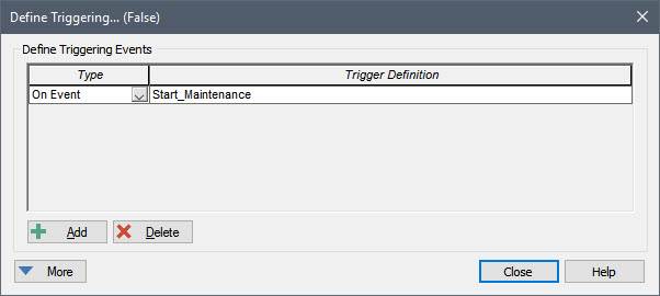
That is, it is set to False when maintenance begins.
But when do we set the Status to True? We want to do this when the maintenance is completed. To do that, we will use an Event Delay element (Complete_Maintenance). Open that element now:

There is a Triggering dialog where you enter the events that you want to delay. Open the Triggering dialog and you will see that it is simply being triggered by the start of maintenance.
The Delay Type determines how the Delay Time is specified. In this case, we have specified a “Defined Mean Time + Std. Deviation”. This means that there is variability in the actual delay times around some mean, and whenever the element is triggered, the delay time for that event is sampled from a distribution (actually a gamma distribution). In this example, we have specified a Mean Time of 3 days and a Std. Deviation of 1 day.
You can ignore the other inputs for now (they are not needed for this example).
The primary output of an Event Delay is simply the delayed event (a discrete signal). We then can use this in the Triggering dialog for setting the Status to True:
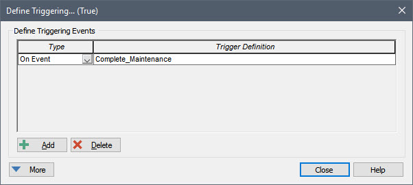
That is, we set the Status to True (i.e., the facility is open again) when maintenance completes.
Note: If the discrete signal leaving the Event Delay is not emitted exactly on a scheduled update (timestep) of the model, the element causes an unscheduled update of the model in between the scheduled updates so that that the actual delay time for discrete signal is very accurately represented.
Run the model and double-click on the Time History result element to display a time history of the Status:
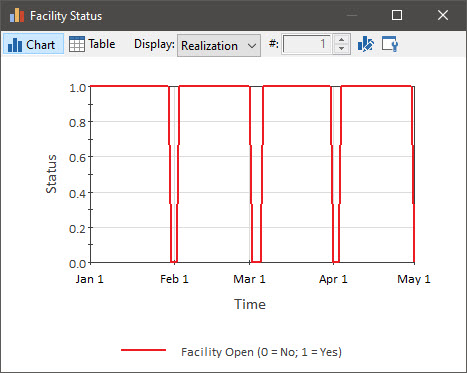
As can be seen, the facility closes every 30 days, and reopens about 3 days after it closes. As noted above, in a real application, this Status might then be referenced by other elements to control their behavior.
Note: In this particular example, we used a Status and an Event Delay to simulate preventive maintenance of a facility/component. Although this may actually be sufficient for many such applications, GoldSim provides much more powerful tools for modeling such processes in the Reliability Module (a specialized extension module used to simulate problems associated with reliability, availability, maintenance and risk analysis for engineered systems). Although we will mention this module briefly in the final Unit, it is beyond the scope of this Course to discuss it in any detail.
In the Example model above, we used the Event Delay as a “timer” for a process that was occurring (in this case, the preventive maintenance). Although this is valuable (and commonly used), it is a rather simple application of an Event Delay. Let’s examine another example of modeling a process that is a bit more complex.
The model can be found in the “Examples” subfolder of the “Basic GoldSim Course” folder you should have downloaded and unzipped to your Desktop. In that folder, open a model file named Example27_TSA1.gsm.
This model simulates a system we are all (unfortunately!) familiar with: the security checkpoint at an airport. The model runs for 8 hours (with a 5 second timestep).
The model looks like this:
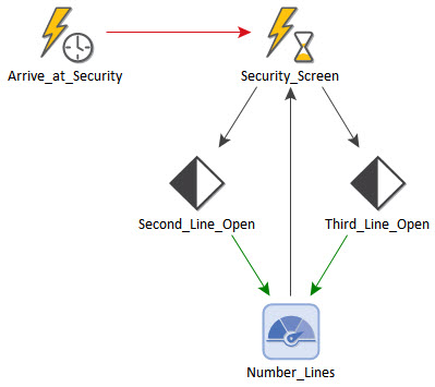
The Timed Event element (Arrive_at_Security) generates random events representing items (people) arriving at the security checkpoint (5 per minute).
Note: Of course, in a more realistic model, the arrivals would follow some temporal pattern (e.g., according to the frequency of flights at different times of the day). This is ignored in this simple model.
The Event Delay (Security_Screen) represents the screening process itself. Before we look at this in detail, however, let’s take a step back and think about the kinds of things we need to consider when modeling a “process” like this. In addition to a process taking a specified amount of time to complete, another important parameter that describes a process is how many items or instances can be simultaneously processed. In the example of a security checkpoint, each line can process one item (i.e., one person) at a time – that is, one person goes through the scanner at a time. Of course, if more lines are open, more people can be processed simultaneously (one for each line).
If items (people in this case) are arriving faster than they can be processed, a queue (i.e., line) forms. Hence, one of the key measures of a process is the size of the queue formed behind it. Once a queue forms, the time to be processed (upon arriving at the end of the queue) is of interest. As we will see below, the Event Delay can be used to represent all of these things.
Let’s start by looking at the Event Delay:
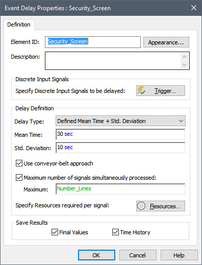
Open the Triggering dialog and you will see that it is simply being triggered by the Timed Event representing arrivals at the security checkpoint. Note also that there is variability in the actual delay times around some mean, such that whenever someone goes through the checkpoint, the time to be processed is sampled from a distribution (with a Mean Time of 30 seconds and a Std. Deviation of 10 seconds).
A key thing to notice here is that the Maximum number of signals simultaneously processed check box is checked, and that Maximum is set to “Number_Lines”. In the previous example (simulating the preventive maintenance) it was not necessary to check this box, since logically, it was impossible for another event to arrive (the start of preventive maintenance) while another was being processed. However, in this case, we need to specify it, as people certainly will arrive while others are being processed.
As we will see below, this model is set up such that the number of lines that are open is a function of the number of people waiting in the queue (i.e., the number of lines that are open is controlled by an active feedback control loop). Before we examine that logic however, let’s first left-click on the output port of the Event Delay, to show its output interface with all of the element’s outputs (indented under the element name):
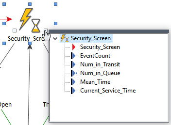
The primary output (the output with the same name as the element) is simply a discrete signal (i.e., the same type of output generated by the Timed Event). The Event Delay simply accepts events and then “releases” them after a specified delay.
However, there are also a number of other outputs provided by the Event Delay (all of which can be displayed, since they are values or conditions):
- EventCount is an integer that represents the cumulative number of discrete signals emitted (the Timed Event and Triggered Event elements have the same output). In this case, it represents the cumulative number of people who have been processed by the security checkpoint.
- Num_in_Transit is an integer representing the number of items (signals) currently being processed (as we will see below, in this model this can be as high as 3).
- Num_in_Queue is a very important output in this case. It is the size of the queue of items waiting to be processed (i.e., the number of people waiting in line).
- Mean_Time is the mean time (averaging over all items processed up until that point in the simulation) to transit the system (from when it arrived until it was finally processed, accounting for the time waiting in the queue).
- Current_Service_Time is the expected time it will take a newly arriving item to transit the system. It is approximated as the time it took the most recent item to transit the system (from when it arrived until it was finally processed, accounting for the time waiting in the queue).
As can be seen, these outputs provide us with precisely the kind of information we require when evaluating the performance of a process (such as a security checkpoint).
Let’s now look closely at the logic used to define the number of lines that are open at the security checkpoint. This is represented by the element named Number_Lines. It is used to specify the number of signals (i.e., people) that can be simultaneously processed by the Event Delay, and is defined using a Selector:
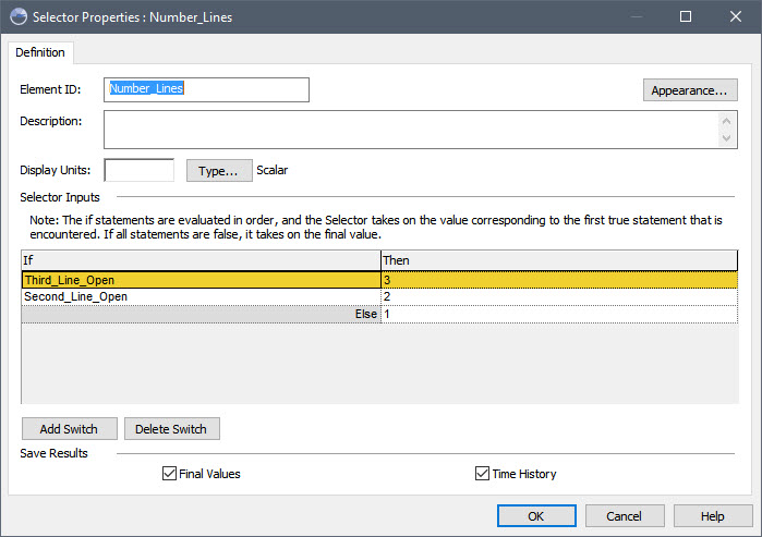
As can be seen, it takes on a value of either 1, 2 or 3, based on the outputs of two Status elements (Third_Line_Open and Second_Line_Open).
The logic that is implemented using the two Status elements is set up to work as follows:
- If the queue size exceeds 100, a second line is opened; once it drops below 50, the second line is closed.
- If the queue size exceeds 300, a third line is opened; once it drops below 200, the third line is closed.
Take a look at the Triggering dialogs for the two Status elements to see how this logic is implemented.
Now that we see how the model is built (and have an understanding of the outputs for an Event Delay), let’s run the model.
Double-click on the Time History Result element named Queue:
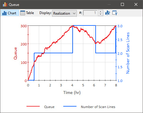
This shows the number of people in the queue (the Num_in_Queue output of the Event Delay) and the number of lines open (the Number_Lines Selector). As can be seen, the queue grows and then oscillates between 200 and 300 (due to the logic for opening and closing lines).
Now double-click on the Time History Result element named Wait Time:
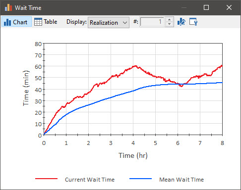
This shows the mean and current wait times for people arriving at the security checkpoint (the Mean_Time and Current_Service_Time outputs of the Event Delay).
These two simple models provide a good introduction to the Event Delay element. You can read about some of the more advanced features in GoldSim Help.
In addition to using an Event Delay to delay a discrete signal, GoldSim provides a similar element (a Discrete Change Delay) to delay a discrete change signal. The Discrete Change Delay is actually more powerful than an Event Delay for simulating processes. This is because discrete change signals carry more information (i.e., a Value), and the Delay Time can be defined as a function of the Value of the discrete change signal being processed. We will not discuss the Discrete Change Delay in this Course. You can, however, read all about this element in GoldSim Help.