Courses: Introduction to GoldSim:
Unit 12 - Probabilistic Simulation: Part I
Lesson 9 - Selecting Probability Distributions
So far in this Unit we have started to discuss how to define and use probability distributions in a probabilistic simulation model, but we have not yet discussed how you decide what probability distributions to use. This Lesson briefly discusses this important topic. This is another “theoretical” as opposed to “hands-on” discussion, but if you want to carry out probabilistic simulations (and avoid the most common errors) you are strongly encouraged to take a few minutes to read through this Lesson.
If you are using your distribution to represent random variability (e.g., the flow rate in a river), you could measure the flow rate of a river once every hour for a week, and then fit the data to a particular distribution. There are tools available that take data points collected in this way and fit them to a particular frequency distribution (GoldSim also provides several ways to construct a generic input CDF).
Specifying distributions that represent uncertainty due to lack of knowledge, however, is more difficult. In these cases, probability distributions cannot be determined simply by making repeated measurements, but must be based on subjective assessments. Subjective assessments are opinions and judgments about probabilities, based on experience and/or knowledge in a specific area, which are consistent with available information.
The process of developing these assessments is sometimes referred to as expert elicitation. Subjectively derived probability distributions can represent the opinions of individuals or of groups. There are a variety of methods for developing subjective probability assessments, ranging from simple informal techniques to complex and time-consuming formal methods. However, it is well beyond the scope of this Course to discuss these methods. Appendix B of the GoldSim User’s Guide provides a brief discussion of each distribution provided by GoldSim, and Appendix A of that document provides a list of references that describe in more detail the applicability of various distribution types (and also provides references that discuss formal expert elicitation methods).
It is strongly recommended that you browse Appendix B to get a better idea of what various distributions look like and the kinds of parameters they are often used to describe. In this Lesson, however, since they are discussed in detail in that Appendix, rather than focusing on the details of the various distributions, instead we will briefly describe three of the most common misunderstandings and errors that are made when defining probability distributions:
- Underestimating your uncertainty
- Combining variability and uncertainty
- Ignoring correlations
Underestimating Your Uncertainty
Let’s start the discussion by assuming that you are asked to express your uncertainty in the distance between two cities. Suppose that you thought it was likely between 100 km and 200 km. To express your uncertainty, therefore, you might choose the simplest distributional form: the Uniform distribution:

In a Uniform distribution, you specify a Minimum and a Maximum, and there is a constant probability density between those two endpoints (hence, in the example above, the probability of the actual distance being between 110 km and 111 km is the same as the probability of the distance being between 170 km and 171 km). Because this distribution is so simple, many people may be tempted to use it. Although such a distribution may be appropriate in some situations, it is important to understand exactly what it implies. In the example shown above, the distribution states, for example, that there is a significant probability (actually 1%) that the distance is between 199 km and 200 km, but exactly zero probability that it is greater than 200 km. So the question you must ask yourself is: “Is this reasonable?” That is, if it could be 199 km, why couldn’t it be 201 km? Of course, in some situations, there may be a physical reason for the bounds. But if there is not, it becomes very difficult to defend the abrupt drop in probability at the bounds.
We could start to address such an issue by using a Triangular distribution, rather than a Uniform distribution. The Triangular distribution requires a Minimum, Most Likely and Maximum value:
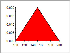
In this example, we still have the same bounds, but have specified a most likely value somewhere in the middle (here the distribution is symmetric, but it does not have to be). We still have the issue that there is a non-zero probability that the distance is between 199 km and 200 km, and exactly zero probability that it is greater than 200 km, but at least now the probability that it is between 199 km and 200 km is relatively low. That is, the probability decreases as we approach the bounds.
Nevertheless, the “hard” bounds here are problematic. Are you really sure that the distance could not be less than 100 km and could not be greater than 200 km? In some models, this kind of question is of great importance. This is because the performance of the system may change drastically at the “edges” of the distribution. In this example, perhaps you only have enough gas to drive 200 km. If the actual distance is 202 km, there would be a significant impact on your travel time (as you would need to walk the final 2 km!). That is, although there might be a low probability of the distance being greater than 200 km, there is a large consequence if it is. In many systems, it is not uncommon for inputs and outputs to exhibit highly non-linear behavior like this (i.e., there is a sharp jump in travel time if the distance exceeds 200 km).
Hence, if the probability of something is low, but the consequence is very high, it is important to capture that in your model. Ignoring such low probability, high consequence events can lead to poor design and policy decisions that could have catastrophic results (e.g., not considering the possibility of water rising above a certain level after an earthquake and tsunami).
Low probability, high consequence values can be represented by using distributions that don’t have “hard” bounds, but instead have “long tails” and asymptotically approach a probability density of zero. The Normal distribution (which is symmetric) is an example. Many other distributions also behave like this (and can be specified to be asymmetric):
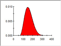
The primary point of this discussion is simply to make you aware of the “spread” of the distributions you choose to express your uncertainty. A very common error is to underestimate the degree of your uncertainty, and hence exclude potentially high or low values that could have a significant impact on your predicted results.
Combining Variability and Uncertainty
We have already discussed another common error that is made when defining probability distributions to describe your uncertainty in parameters in Lesson 3 of this Unit that is worthwhile to reiterate here.
In that Lesson, we noted that it is very common for parameters to be both uncertain and variable (in space or across a group). We used the example of representing the efficacy of a new drug for which the efficacy is different for different age groups, and for each age group, there exists scientific uncertainty regarding its efficacy.
A common mistake in such a situation would be to try to define a single probability distribution for the efficacy that “lumps together” both the variability in the efficacy due to age and the uncertainty in the efficacy (which might actually differ for each age group). One of the (several) problems with such an approach is that it can be very misleading, and can lead to incorrect interpretations of the simulation results. For example, if the drug had been studied extensively, such that the efficacy for each age group had only a small amount of uncertainty, but the variability in efficacy was wide between age groups, lumping those together would result in a misleading amount of uncertainty in simulation results.
The correct way to handle such a situation would be to disaggregate the problem (by explicitly modeling each age group separately) and then define different probability distributions for the efficacy for each age group (with each distribution representing only the scientific uncertainty in the efficacy for that age group).
Ignoring Correlations
Perhaps the most common error that is made when defining probability distributions involves the issue of correlation.
Frequently, parameters describing a system will be correlated (inter-dependent) to some extent. For example, if one were to plot frequency distributions of the height and the weight of the people in an office, there would likely be some degree of positive correlation between the two: taller people would generally also be heavier (although this correlation would not be perfect).
One way to express correlations in a system is to directly specify correlation coefficients between various model parameters (these vary from -1 to 1; a value close to -1 indicates a strong negative correlation, while a value close to 1 indicates a strong positive correlation). In practice, however, assessing and quantifying correlations in this manner can be difficult. A more practical way of representing correlations is to explicitly model the cause of the dependency. That is, the analyst adds detail to the model such that the underlying functional relationship causing the correlation is directly represented.
For example, one might be uncertain regarding the solubility (i.e., the maximum possible dissolved concentration) of two contaminants in water, while knowing that the solubilities tend to be correlated. If the solubilities were both strongly dependent on the pH of the water, and the main source of the uncertainty in the solubilities was actually due to uncertainty in the pH, the two solubilities could be explicitly correlated by defining each solubility as an equation that was a function of the pH. If both solubilities increased or decreased with increasing pH, the correlation would be positive. If one decreased while one increased, the correlation would be negative.
Ignoring correlations, particularly if they are very strong, can lead to physically unrealistic simulations. In the above example, if the solubilities of the two contaminants were positively correlated (e.g., due to a pH dependence), it would be physically inconsistent for one contaminant’s solubility to be selected from the high end of its possible range while the other’s was selected from the low end of its possible range. Hence, when defining probability distributions, it is critical that the analyst determine whether correlations need to be represented.
Due to the importance of representing correlations, we will spend the next two Lessons discussing this in more detail.