Courses: Introduction to GoldSim:
Unit 11 - Dealing with Dates and Time
Lesson 10 - Computing Moving Averages Using Integrator Elements
In the previous Lesson we discussed the use of Reporting Periods, which among other things, allow you to take a model with a short timestep (e.g., daily), and report average values over longer specified periods (e.g., monthly, annually). In some cases, however, you may want to compute a different kind of average – a moving average. For example, at any point in the simulation, you might want to be able to reference the average value of a variable over the previous 10 days.
Why would you want to do this? As an example, consider a case where you are simulating a system that constantly adjusts one variable (e.g., a pumping rate from a pond) based on the value of some other variable (an inflow rate into the pond). If the inflow rate was highly variable, you probably would not want to adjust the pumping rate based on the current (instantaneous value) of the inflow rate (as the pumping rate would then also vary widely), but instead on the average value of that inflow rate over some previous period (which will smooth the variations in the inflow rate).
Note: Moving averages are not limited to calendar-based models. They are of value for elapsed time models too. However, they are discussed here in order to contrast them with the average values you can compute using Reporting Periods.
Mathematically, the moving average of X over averaging time ATime is computed as follows:
\(\mathrm{Moving\ Average \ of \ X\ at\ time\ t=\displaystyle \frac{\int\limits_{ETime-ATime}^{ETime}X\ dt}{ATime} }\)
That is, it is a time integral. We have already noted previously that GoldSim Stock elements (Pools, Reservoirs and Integrators) solve time integrals. We have discussed Pool and Reservoir elements in some detail, but have not yet discussed Integrators. Integrators are simplified versions of Reservoirs (although as we shall see, they provide some specialized features that Reservoirs do not). In particular, Integrators provide the (optional) ability to compute a moving average.
To illustrate how we can use an Integrator to compute moving averages, we are going to revisit the Example we modified in the previous Lesson. You should have saved this file (as Example18_TimeShifting_with_Reporting_Periods.gsm) in the “MyModels” subfolder of the “Basic GoldSim Course” folder on your desktop. If you do not have this file, you can find it in the Examples folder.
Open the model and make sure it is Edit Mode. We are going to compute a moving average of the stream flow. To do so, insert an Integrator element (you will find it in the “Stocks” category):
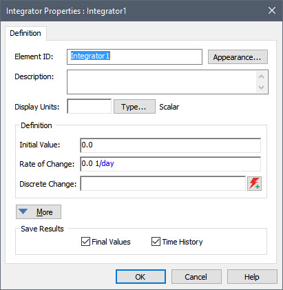
As you can see, the Integrator is a simplified version of the Reservoir:
- Both require an Initial Value.
- The Integrator combines the Reservoir’s two Rate of Change inputs (for Additions and Withdrawal Requests) into a single Rate of Change (which can be positive or negative).
- The Integrator does not have a Lower Bound or an Upper Bound.
Although mathematically Reservoirs and Integrators are quite similar, the differences outlined above are due to the fact that the two elements are intended to represent different things. Whereas Reservoirs (and Pools) are intended to integrate/accumulate material flows (e.g., water, people, money, widgets), Integrators are intended to simply integrate information (e.g., integrating the velocity of a car over time would result in the distance traveled). Clearly differentiating these two kinds of integrals in a model can help to make the model clearer and more transparent.
In our case, we are going to use one of the Integrator’s advanced capabilities to carry out the time integration presented at the beginning of this Lesson.
To access these capabilities, press the More button:
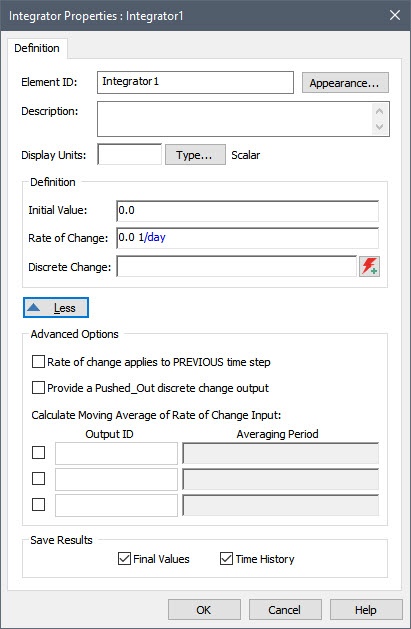
As can be seen, the Integrator provides the ability to compute up to three moving averages. Before we specify those, however, let’s set up the rest of the inputs:
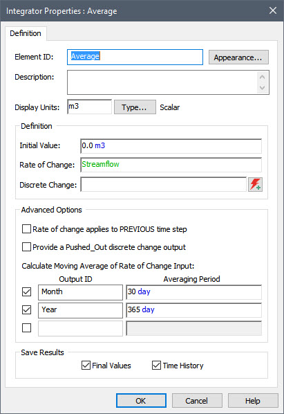
- First, let’s name the element “Average”.
- An Integrator computes the moving average of the Rate of Change input field. Since this is going to be a volumetric flow rate, the Display Units for the Integrator itself must be a volume. Let’s enter m3.
- Next we need to enter the Time Series element (Streamflow) into the Rate of Change field. This is the variable for which we are going to compute the moving average.
- Now we can define up to three moving averages to compute. We do so by checking the box next to each one. For each moving average, we need to specify an Output ID and an Averaging Period. Let’s compute two moving averages: 30 days and 365 days.
When you are done, the dialog should look like this:
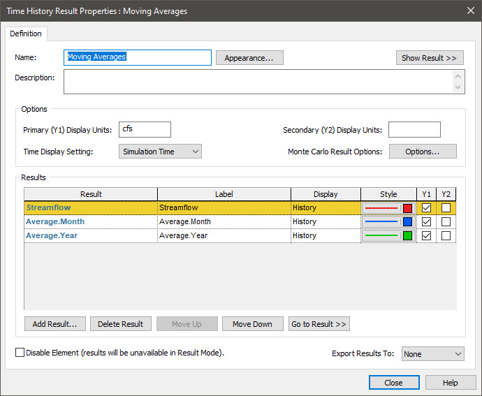
Before running the model, let’s set up a new Time History Result element to view the results. Insert a Time History Result element now:
- Name it "Moving Averages"
- Press the Add Result… button and add the Time Series itself (Streamflow).
- Press the Add Result… button and add the “Month” output of the Average Integrator. This is a secondary output of the Integrator that was added when we defined this moving average.
- Press the Add Result… button a third time and add the “Year” output of the Average Integrator. This is a secondary output of the Integrator that was added when we defined this moving average.
The dialog should look like this:
Now close the dialog, run the model and double-click on the Time History Result element to view the results:
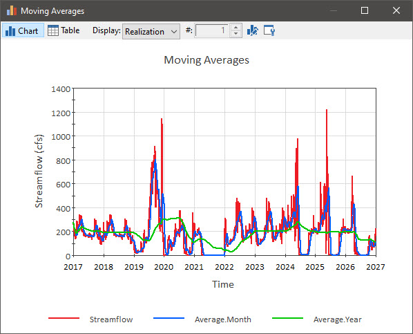
As can be seen, the moving average smooths the variations in the flow rate, and because it is backward-looking, shifts the peaks to the right (i.e., delays them).
You can read more about moving averages in GoldSim Help.