Courses: Introduction to GoldSim:
Unit 16 - Documenting Your Model
Lesson 6 - Adding Hyperlinks to the Graphics Pane
We’ve seen in previous Lessons that you can insert hyperlinks to other documents (e.g., web pages, PDF documents, etc.) within Text Boxes and Notes. This provides a very powerful way to document your models. In addition to these two methods, GoldSim provides a third way to add a hyperlink: you can add one directly to the graphics pane. Not only can you use this to jump to websites and documents, as we shall see, you can also use it to navigate your model (by providing a link that “jumps” to another part of the model).
Let’s open a new model to experiment with this capability.
To insert a hyperlink, select Graphics|Insert|Hyperlink… from the main menu. The following dialog will be displayed:
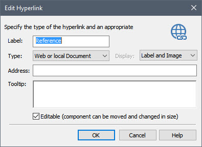
The Label appears below the Hyperlink object in the graphics pane. Note that unlike element IDs, the label can have spaces (but it cannot be completely empty). For now, enter “Learn More”.
The Type field contains the type of hyperlink you wish to make in the Address field. GoldSim provides the following options:
- Web or local document: Opens a website or a document (e.g., a Word or PowerPoint document);
- Email to…: Opens your default email program and inserts the specified email address in the “To” field.
- FTP: Opens an FTP site.
- Execute Command: Opens a specific program.
- Go to Element: Jumps to a specific element and selects it. This is useful for navigating a model.
- Open Container: Jumps to a specific Container. This is useful for navigating a model.
- Open Dashboard: Jumps to a specific Dashboard (Dashboards are discussed in the next Unit). This is useful for navigating a model.
In the latter three cases, after selecting the option, you must specify the element, Container or Dashboard that you wish to link to.
Note: The final three options provide a valuable tool for helping to navigate a complex model.
In this example, let’s just select the default option and link to the GoldSim website:
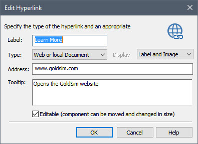
You can also enter a Tooltip. This is displayed when you place your cursor over the Hyperlink object in the graphics pane.
If the Editable check box is checked (the default), you will be able to move the Hyperlink object around the graphics pane (and resize it). If this checkbox is cleared, the object will be “pinned” to the location where you placed it. Once it is pinned, you can make the object editable by right-clicking on it in the graphics pane and checking the Editable menu item. Likewise, you can lock (make uneditable) an editable hyperlink by right-clicking on it in the graphics pane and clearing the Editable menu item.
After entering the Hyperlink’s properties in the dialog and pressing OK, you will be presented with a "placement cursor":

When you click with the cursor, the Hyperlink object is inserted at that location. The Hyperlink object looks like this:

As we will see in the next Lesson, you can customize the appearance of this symbol.
Click on it and you will see that it will jump to the GoldSim website.
After inserting a Hyperlink object, you can access the dialog for editing the Hyperlink’s properties by selecting Properties… from the context menu for the object.